NRS supports the following widgets:
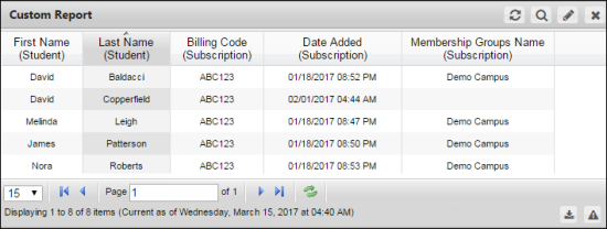
The Custom Reports allows you to create report templates based on the combination of criteria, with many formatting options into a single easy-to-read, fully personalized report. Formatting options include headings, columns, sorting, and others. Report output can be exported in .CSV format.
Note:
In a custom report, you can have only one dataset per widget.
For more information about custom reports widget settings, see Add a Custom Report Widget.
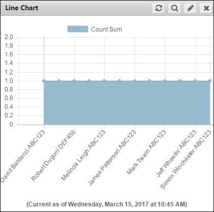
Line Chart displays comparison between two variables, line graphs involve an X axis horizontally and a Y axis vertically on a grid. Line charts are simple and easy to understand and are typically used to show trends over a period of time. They organize and present data in a clear manner and show relationships between the data. While line charts and bar charts share the same purpose, line graphs display a change in direction, while bar graphs display a change in magnitude.
For more information about line chart widget settings, see Add a Line Chart Widget.
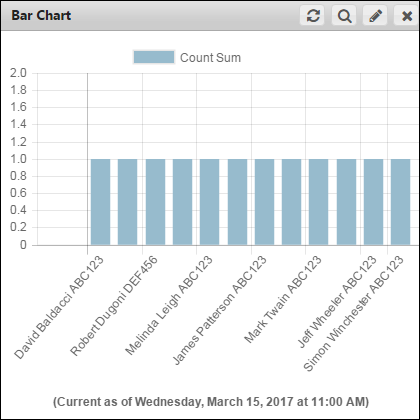
Bar charts are used to present and compare data. They are easy to understand, because they consist of rectangular bars that differ in height or length according to their value or frequency.
For more information about bar chart widget settings, see Add a Bar Chart Widget.
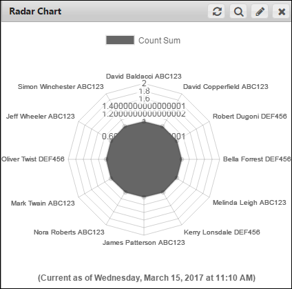
Radar chart displays a two-dimensional chart of more than three variables represented on axis starting from the same point. Radar chart is also known as polar chart, spider chart, or web chart. Each variable in the Radar chart is provided with axis that start from the center. All axis are arranged radially, with equal distances between each other, while maintaining the same scale between all axis. Radar charts are primarily used as a data comparison tool to visually correlate aspects such as growth against benchmarks, progress over several criteria, and others.
Note:
In a radar chart, you can have only one dataset per widget.
For more information about radar chart widget settings, see Add a Radar Chart Widget.
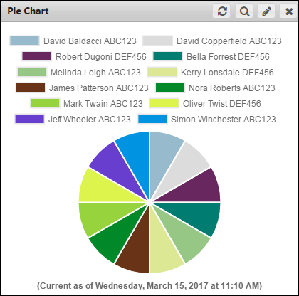
A Pie chart is a circular statistical graphic which is divided into slices and it resembles the slices of pie. This chart displays data, information, and statistics in an easy-to-read format. The variables are plotted around a circle in either a clockwise direction. The variables are usually in percentage and can contain any value from zero to 100 percent. A pie chart is most effective when plotting more than three categories of data.
Note:
In a pie chart, you can have only one dataset per widget.
For more information about pie chart widget settings, see Add a Pie Chart Widget.
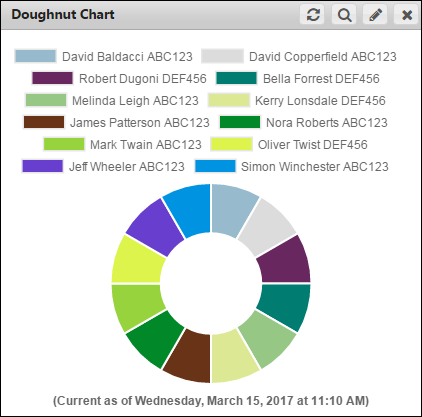
A doughnut chart is similar to a pie chart, with the exception of a blank center and the ability to support multiple statistics at once. This chart provides a better data intensity ratio as compared to a standard pie chart.
Note:
In a doughnut chart, you can have only one dataset per widget.
For more information about doughnut chart widget settings, see Add a Doughnut Chart Widget.
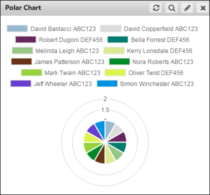
The Polar chart is a circular graph. In this graph the data points are displayed using the angle, and the distance from the center point. The X axis are located on the boundaries of the circle and the Y axis connect the center of the circle with the X axis.
Note:
In a polar chart, you can have only one dataset per widget.
For more information about polar chart widget settings, see Add a Polar Chart Widget.
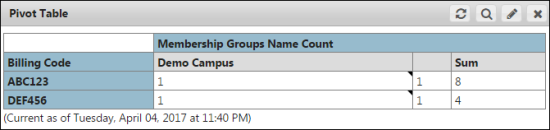
Pivot tables can help quickly summarize the report data and highlight the desired information. It takes a flat report and groups by the specific row data to add vertical columns that perform mathematical operations on the selected numerical data.
Note:
In a pivot table, you can have only one dataset per widget.
For more information about pivot table widget settings, see Add a Pivot Table Widget.
© NexPort Solutions 2017. All Rights Reserved.