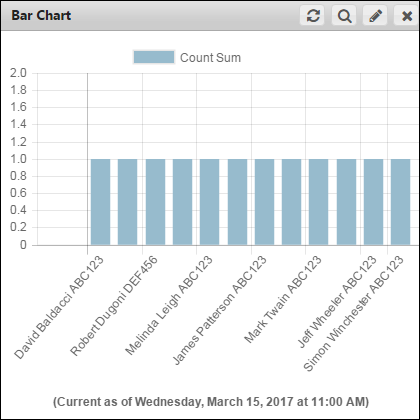
You can personalize and customize the bar chart appearance. Bar charts automatically generate colors based on the number of data points.
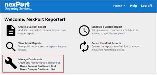
- On the NRS homepage, click Manage Dashboards.
-
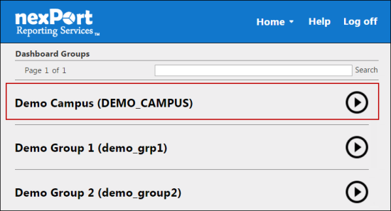
- The Dashboards Groups page is displayed.
- Select a group to view its dashboards.
-
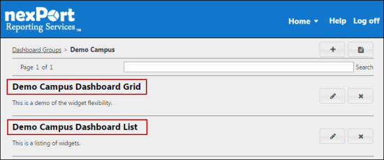
- A dashboard list for the selected group is displayed.
- Select a dashboard (Grid view or List view) to which you need to add a bar chart widget.
-
- The <DashboardName> page is displayed.
-
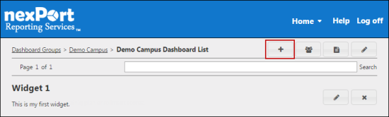
- In the upper-right corner, click the
 icon.
icon.
- The Add Widget dialog box is displayed.
-
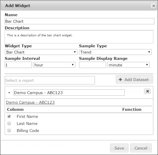
- In the Name box, type a name for the widget.
Note:
The widget name appears on the widget title bar.
- In the Description box, type a brief description of the widget.
- In the Widget Type list, select Bar Chart.
- In the Sample Type list, select one of the following sample types:
- Snapshot: On the dashboard, the bar chart is displayed based on the current report.
- Trend: On the dashboard, the bar chart is displayed based on samples of the report taken at the trend interval.
Note:
On the dashboard, in the title bar of the bar chart widget this icon is displayed and is used to control the date range of data points to view.
- In the Sample Interval box, select sample report trend interval in minutes, hours, days, weeks, months, or years.
- In the Sample Display Range box, select the default report display range in minutes, hours, days, weeks, months, or years.
- In the box, search for a report, and then select a report.
- All reports in your organization or its descendants appear in the box. Parent organization filters appear for subgroup as well. In a widget you can select reports that are public or the reports that you have authored.
Note:
A warning sign next to the report title indicates that the report contains organization filters that do not allow dashboard access. The data for those organizations is not displayed on the dashboard.
- Click Add Dataset.
Note:
In a bar chart, you can have multiple dataset per widget.
You can modify the dataset label.
Click the  icon if you need to remove the dataset.
- In the Column section, select the X axis and Y axis for the bar chart.
Note:
If you have Y axis available, you can select the function to apply to your result dataset at each interval. If you do not have a numeric Y axis available, the Y axis for your chart defaults to the count of grouped X axis values.
- Click Save.
- The bar chart widget is saved and appears on your dashboard.
-